Greetings, and welcome to the fourth week of the AntArchitect development cycle! Today, we’re excited to share our new logo, as well as some updates regarding our progress.
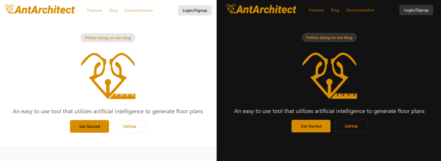
We’re very happy with how the logo turned out, and hope that it will strengthen our brand. It bears resemblance to an ant’s head, where the lower part of the face seamlessly transitions into a pen drawing with a ruler. This design embodies both components of our product name, the ant and the architect, representing the harmony between the natural world and human innovation.
For the color, we chose a shade of gold, which evokes a sense of premium quality and elegance. The warm color also provides a comfortable visual experience for our users, and it fits well with both light and dark modes. You can get a feel for the colors yourself by switching between light and dark mode in the blog settings, but we’ll also showcase them in our latest sneak peek of the frontend below.
The Next Step
Our first sprint is coming to an end, and by next week we plan on having a product that can do three simple things:
-
Provide users with a visual editor
-
Send dummy data from the editor to our API
-
Return simple AI generated floor plans to the editor
We don’t expect the product to handle and visualize any real data at this point, nor the algorithm for floor plan generation to be working perfectly, as our goal for the first sprint is more about tying the different parts together. Once we have established a clear standard for how data should be transferred, and what parameters should be included, we can start fine tuning and enhancing the experience.
Thank you for joining us on our journey!
Best regards,
The AntArchitect Team
The AntArchitect Team
We are a group of 10 students who have embarked on an exciting journey to revolutionize the way we envision floor plans, with the power of artificial intelligence.